Data Interpretation is one of the easy sections of one day competitive Examinations. It is an extension of Mathematical skill and accuracy. Data interpretation is nothing but drawing conclusions and inferences from a comprehensive data presented numerically in tabular form by means of an illustration, viz. Graphs, Pie Chart etc. Thus the act of organising and interpreting data to get meaningful information is Data Interpretation. A good grasp of basic geometric as well as arithmetic formulae is must to score high in this section. Familiarity with graphical representation of data like Venn diagrams, graphs,pie charts, histogram, polygon etc. should be thought. Once the data are grasped well, questions based on tables and graphs take little time.
In some competitive examinations data are presented in more than one table or graphs. The aim is to test not only quantitative skill but also relative, comparative and analytical ability. The crux of the matter is to find a relationship between the two tables or graphs before attempting the questions.
Some Useful tips:
1 . Data Interpretation questions are based on information given in tables and graphs.These questions test your ability to interpret the information presented and to select the appropriate data for answering
a question.
2 . Get a general picture of the information before reading the question. Read the given titles carefully and try to understand its nature.
3 . Avoid lengthy calculations generally, data interpretation questions do not require to do extensive calculations and computations. Most questions simply require reading the data correctly and carefully and putting them to use directly with common sense.
4 . Breakdown lengthy questions into smaller parts and eliminate impossible choices.
5 . Use only the information given and your knowledge of everyday facts, such as the number of hours in a day, to answer the questions based on tables and graphs.
6 . Answer the questions asked and not what you think the questions should be.
7 . Be careful while dealing with units.
8 . To make reading easier and to avoid errors
observe graphs keeping them straight.
9 . Be prepared to apply basic mathematical rules, principles and formulae.
10. Since one of the major benefits of graphs and tables is that they present data in a form that enables you to readily make comparisons, use this visual attribute of graphs and tables to help you answer the questions. Where possible, use your eyes instead of your computational skills.
Tables
Tables are often used in reports, magazines and newspaper to present a set of numerical facts. They enable the reader to make comparisons and to draw quick conclusions. It is one of the easiest and
most accurate ways of presenting data. They require much closer reading than graphs of charts and hence are difficult and time consuming to interpret. One of the main purposes of tables is to make complicated information easier to understand. The advantage of presenting data in a table is that one can see the information at a glance. While answering questions based on tables, carefully read the table title and the column headings. The title of the table gives you a general idea of the type and
often the purpose of the information presented. The column headings tell you the specific kind of information given in that column. Both the table title and the column headings are usually very straight forward.
Graphs
There may be four types of graphs.
1) Circle Graphs: Circle graphs are used to show how various sectors are in the whole. Circle graphs are sometimes called Pie Charts. Circle graphs usually give the percent that each sector receives In such representation the total quantity in question is distributed over a total angle of 360°. While using circle graphs to find ratios of various sectors, don't find the amounts each sector received and then
the ratio of the amounts. Find the ratio of the percents, which is much quicker.
2) Line Graphs: Line graphs are used to show how a quantity changes continuously. If the line goes up, the quantity is increasing; if the line goes down, the quantity is decreasing; if the line is horizontal, the quantity is not changing.
3) Bar Graphs: Given quantities can be compared by the height or length of a bar graph. A bar graph can have either vertical or horizontal bars. You can compare different quantities or the same quantity
at different times. In bar graph the data is discrete. Presentation of data in this form makes evaluation of parameters comparatively very easy.
4) Cumulative Graphs : You can compare several catagories by a graph of the cumulative type. These are usually bar or line graphs where the height of the bar or line is divided up proportionally among different quantities.
I.Bar Graph:
 A. If the expenditure of Company A in 2004 is Rs 36 lakhs, then what is its income in that year?
(1) 42 lakhs (2) 48 lakhs (3) 54 lakhs (4) 60 lakhs (5) 75 lakhs
B. If the income of Company A in 2002 and expenditure of Company B in the same year is equal to Rs 60 lakhs then what is the difference between their net profit in 2002?
(1) 6 lakhs (2) 8 lakhs (3) 10 lakhs (4) 12 lakhs (5) None of these
C. If the income of Company A in 2001 and income of Company B in 2005 is Rs 50 lakhs and Rs 80 lakhs respectively then the profit gained by Company A in 2001 is how much percent more than that of the profit gained by Company B in 2005?
(1) 62.5% (2) 67.5% (3) 82.5% (4) 87.5% (5) 75%
D. Ratio of expenditure to income of Company B in 2004 is how much percent more than that of ratio of expenditure to income of Company A in 2005?
(1) 10% (2) 20% (3) 30% (4) 40% (5) 50%
E. If income of Company A in 2006 is Rs 75 lakhs then what is the expenditure of Company B in the same year?
(1) 60 lakhs (2) 75 lakhs (3) 90 lakhs (4) 87.5 lakhs (5) None of these
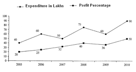
Line chart: Following line graph shows the expenditure and percentage profit of a company of 2005 to 2010.
 F. What is the ratio of income in 2008 and 2010?
(1) 5 : 6 (2) 6 : 7 (3) 7 : 8 (4) 8 : 9 (5) 7 : 9
G. In which year amount of profit is minimum?
(1) 2005 (2) 2006 (3) 2007 (4) 2008 (5) 2009
H. What is the percentage rise in amount of profit gained by Company from 2007 to 2008?
(1) 27% (2) 36% (3) 44% (4) 62.5% (5) 87.5%
I. Expenditure of Company in year 2008 is how much percent more than that of expenditure in 2006?
(1) 15% (2) 20% (3) 25% (4) 27.5% (5) 30%
J. Income of Company in 2005 in what percentage of income of Company in 2010?
(1) 200/3% (2) 279/5% (3) 105/2% (4) 403/9% (5) 320/5%
Table: The table given below gives the number of days worked by employees of five grades A, B, C, D and E in different departments.
 K.
The number of days worked in HR department was highest for which grade ?
K.
The number of days worked in HR department was highest for which grade ?
1) A 2) B 3) C 4) D 5) E
L. The grade which worked least in all departments is ______?
1) Grade E in IT 2) Grade B in HR 3) Grade B in Software
4) Grade D in IT 5) Grade B in Accounts
M. What is the average of working days in IT department?
1) 305 2) 300 3) 296 4) 292 5) None of these \
N. If average working hours in a day are 8 then the amount of work put by Grade C is
1) 13240 2) 12570 3) 32600 4) 12480 5) 9912
M. If working hours in a day are 8 then average work done (in hours) by Grade A in four departments together is
1) 1267 2) 2534 3) 2436 4) 1672 5) None of these
In some competitive examinations data are presented in more than one table or graphs. The aim is to test not only quantitative skill but also relative, comparative and analytical ability. The crux of the matter is to find a relationship between the two tables or graphs before attempting the questions.
Some Useful tips:
1 . Data Interpretation questions are based on information given in tables and graphs.These questions test your ability to interpret the information presented and to select the appropriate data for answering
a question.
2 . Get a general picture of the information before reading the question. Read the given titles carefully and try to understand its nature.
3 . Avoid lengthy calculations generally, data interpretation questions do not require to do extensive calculations and computations. Most questions simply require reading the data correctly and carefully and putting them to use directly with common sense.
4 . Breakdown lengthy questions into smaller parts and eliminate impossible choices.
5 . Use only the information given and your knowledge of everyday facts, such as the number of hours in a day, to answer the questions based on tables and graphs.
6 . Answer the questions asked and not what you think the questions should be.
7 . Be careful while dealing with units.
8 . To make reading easier and to avoid errors
observe graphs keeping them straight.
9 . Be prepared to apply basic mathematical rules, principles and formulae.
10. Since one of the major benefits of graphs and tables is that they present data in a form that enables you to readily make comparisons, use this visual attribute of graphs and tables to help you answer the questions. Where possible, use your eyes instead of your computational skills.
Tables
Tables are often used in reports, magazines and newspaper to present a set of numerical facts. They enable the reader to make comparisons and to draw quick conclusions. It is one of the easiest and
most accurate ways of presenting data. They require much closer reading than graphs of charts and hence are difficult and time consuming to interpret. One of the main purposes of tables is to make complicated information easier to understand. The advantage of presenting data in a table is that one can see the information at a glance. While answering questions based on tables, carefully read the table title and the column headings. The title of the table gives you a general idea of the type and
often the purpose of the information presented. The column headings tell you the specific kind of information given in that column. Both the table title and the column headings are usually very straight forward.
Graphs
There may be four types of graphs.
1) Circle Graphs: Circle graphs are used to show how various sectors are in the whole. Circle graphs are sometimes called Pie Charts. Circle graphs usually give the percent that each sector receives In such representation the total quantity in question is distributed over a total angle of 360°. While using circle graphs to find ratios of various sectors, don't find the amounts each sector received and then
the ratio of the amounts. Find the ratio of the percents, which is much quicker.
2) Line Graphs: Line graphs are used to show how a quantity changes continuously. If the line goes up, the quantity is increasing; if the line goes down, the quantity is decreasing; if the line is horizontal, the quantity is not changing.
3) Bar Graphs: Given quantities can be compared by the height or length of a bar graph. A bar graph can have either vertical or horizontal bars. You can compare different quantities or the same quantity
at different times. In bar graph the data is discrete. Presentation of data in this form makes evaluation of parameters comparatively very easy.
4) Cumulative Graphs : You can compare several catagories by a graph of the cumulative type. These are usually bar or line graphs where the height of the bar or line is divided up proportionally among different quantities.
I.Bar Graph:
(1) 42 lakhs (2) 48 lakhs (3) 54 lakhs (4) 60 lakhs (5) 75 lakhs
B. If the income of Company A in 2002 and expenditure of Company B in the same year is equal to Rs 60 lakhs then what is the difference between their net profit in 2002?
(1) 6 lakhs (2) 8 lakhs (3) 10 lakhs (4) 12 lakhs (5) None of these
C. If the income of Company A in 2001 and income of Company B in 2005 is Rs 50 lakhs and Rs 80 lakhs respectively then the profit gained by Company A in 2001 is how much percent more than that of the profit gained by Company B in 2005?
(1) 62.5% (2) 67.5% (3) 82.5% (4) 87.5% (5) 75%
D. Ratio of expenditure to income of Company B in 2004 is how much percent more than that of ratio of expenditure to income of Company A in 2005?
(1) 10% (2) 20% (3) 30% (4) 40% (5) 50%
E. If income of Company A in 2006 is Rs 75 lakhs then what is the expenditure of Company B in the same year?
(1) 60 lakhs (2) 75 lakhs (3) 90 lakhs (4) 87.5 lakhs (5) None of these
Line chart: Following line graph shows the expenditure and percentage profit of a company of 2005 to 2010.
(1) 5 : 6 (2) 6 : 7 (3) 7 : 8 (4) 8 : 9 (5) 7 : 9
G. In which year amount of profit is minimum?
(1) 2005 (2) 2006 (3) 2007 (4) 2008 (5) 2009
H. What is the percentage rise in amount of profit gained by Company from 2007 to 2008?
(1) 27% (2) 36% (3) 44% (4) 62.5% (5) 87.5%
I. Expenditure of Company in year 2008 is how much percent more than that of expenditure in 2006?
(1) 15% (2) 20% (3) 25% (4) 27.5% (5) 30%
J. Income of Company in 2005 in what percentage of income of Company in 2010?
(1) 200/3% (2) 279/5% (3) 105/2% (4) 403/9% (5) 320/5%
Table: The table given below gives the number of days worked by employees of five grades A, B, C, D and E in different departments.

1) A 2) B 3) C 4) D 5) E
L. The grade which worked least in all departments is ______?
1) Grade E in IT 2) Grade B in HR 3) Grade B in Software
4) Grade D in IT 5) Grade B in Accounts
M. What is the average of working days in IT department?
1) 305 2) 300 3) 296 4) 292 5) None of these \
N. If average working hours in a day are 8 then the amount of work put by Grade C is
1) 13240 2) 12570 3) 32600 4) 12480 5) 9912
M. If working hours in a day are 8 then average work done (in hours) by Grade A in four departments together is
1) 1267 2) 2534 3) 2436 4) 1672 5) None of these
No comments:
Post a Comment